Sunday, September 19, 2010

Launch at Michelle's

Long time between posts, I know. I had trouble finding the charger for our camera! Necessity made me find it so I could print up instructions for Michelle's 2010-2011 Catalogue Launch yesterday. I was a guest/helper and I demonstrated this card using an adapted technique from a video tutorial at Valita's Fresh Folds blog. Hydrangea's are one of my favourite flowers and are so pretty in various colours! The flowers are created using Valita's technique with the new Fancy Flower XL punch rather than the heart punch (which I don't own - yet!). I've added the sentiment from Garden Whimsy together with an antique brad - another new product. The flower centres are a dot of Multipurpose Liquid Glue with Olive supernova glitter. I used the same technique for the flowers to make the leaves with the scallop oval punch.
I also helped with this make-and-take card using the new Morning Cup stamp set and Take a Sip wheel. I have the clearmount version so it was a great opportunity to show off how easily the images assemble without having to use a stamp-a-majig. I love my clearmount stamps and especially love the Stampin' Up! clear blocks - they are a beautiful weight with a lovely rounded finger-hold edge all the way around. This card was made using reverse-masking to sponge colour into the different areas of the teapot and cup. I used a craft knife to cut away the area to be coloured from an image stamped in the middle of a post-it. Its a great technique for adding even colour to an image and it was so much fun to do with these little tea-cups! The guests all thought I was a bit bonkers for cutting around the little flowers on the teacup. We also used the new Stampin' Write markers now available in the In Colors! WOW! Its so lovely to get detail through with a fine-tip instead of using a blender pen or aquabrush loaded with In Color ink!
I'm thrilled with the new In Colors. This card uses Pear Pizzazz, Peach Parfait and Blushing Bride. Lovely colours!

Saturday, August 07, 2010

Christmas in July projects

Its been a long time between posts, I know... My boss went away for the entire school term, which meant I started working 4 days a week. Pat and I are struggling a little in the office. Its now only 6 weeks and 5 days until the end of term! Not that we're counting down!! LOL
As my 4 day week started earlier than expected, I asked Michelle to substitute for me at a workshop and she kindly accepted. Apparently she made a good substitute teacher and she was a font of knowledge about many things for my lovely ladies!

These are the cards I designed for the workshop. This first one is inked using a sponge on the Medallion stamp. I masked the inside with a circle punched from a post-it and sponged ink first with Garden Green, then Old Olive and finally Kiwi Kiss around the outside. When I'd stamped the image, I thought it looked a bit plain, so I went back with markers to rubber on the holly from Christmas Classics. I used alternated Old Olive and Garden green holly around the Medallion. I then used Real Red to draw over the berries again as they weren't "popping" enough for me! After that a few drops of crystal effects (which I then stuck my finger in before dry!!) on each berry to make them gleam! Oh, and I used the sponge I'd inked the stamp with to decorate the edges of the card. I'm so pleased with the result! The Medallion stamp has to be the most versatile and EASY stamp to use, creating a beautiful single layer card in seconds!
The next card was meant to be a CASE of one of Jayne Mercer's cards. In the end, apart from the layout and using Kraft and Pale Plum, it looks very little like her original! But similar enough to see where the CASE came from.
Because I see the same group of ladies every month, I find it difficult to come up with new box designs with which to WOW them. This one is an adapted "Sevens" box - score at 7 cm all around an A4 card and fold in this complicated way! Once closed, you can fit a chocolate or two inside. When open, the card folds right out so you can put quite a large message inside. Its very cute and quite easy to do. Considering I threw this together, I'm very pleased with the results. I'm going to miss using Kiwi Kiss at the beginning of September!

Which nicely leads to the following information. Stampin' Up! Australia's 2010/2011 catalogue! Its coming! I will have copies in my hot little hands towards the end of this month and ordering from the 2010/2011 catalogue begins on 1 September. There are quite a lot of discounted items and here is part of the Last Chance list. I've sorted this list for the discounted items only first by catalogue page, then alphabetically. Please don't use this PDF without permission. I will post more information in the next couple of weeks. Don't panic about some of these "Last Chance" items. Many of the punches are being re-configured to a new flatter style punch which is great for storage. However, the old style punches will be available until 31 August (or while stocks last).

Thursday, July 08, 2010

Quick post

I've had to head down to Canberra a bit earlier than expected as my step-dad had a mild heart-attack on Monday. He's fine and was delighting in pulling the oxygen saturation monitor off his finger to make the wiggly lines on his monitor go berserk for the kids. Far too big a grin considering he's in hospital hooked up to machines and oxygen and how much of a scare he gave my Mum!

Plans for updating my blog and card-making are on hold while we are visiting. It was also my niece's first birthday yesterday and the tribe and I went over for a quick visit yesterday evening. Claire is walking, a chatty sociable little person who warmed to me rather quicker than I expected and I was BESOTTED! I fell in baby-love again. She reached up and gave me cuddles and sat on my lap quite content for a nice while. So miss seeing both Claire and her big brother day-to-day as they grow.

Just in case the Inklings Christmas in July blog-hop lands here, I'm popping the list in here... Apologies for not being more organised!
Bloghop for Inklings team "Christmas in July"
1. Christie http://www.christiescreativecorner.blogspot.com
2. Dani H http://daniholland.wordpress.com/
3. Carol http://inkantations-and-inkarnations.blogspot.com/
4. Michelle D http://www.stampinkpaper.blogspot.com
5. Jayne http://www.jaynemercer.com/blogs
6. Kylie http://kraftykylie.typepad.com/blossom_designs/
7. Kari http:// www.karigail.wordpress.com
8. Dani F - http://danifender.blogspot.com
9. Beth - http://www.elisabethstewart.com/bethinking/
10. Nicky A http://www.nickyadamson.blogspot.com
11. clare http://www.crafty-cow.com
12. Ryn http://rynscraps.blogspot.com
13. Amy http://amyandersonsblog.blogspot.com
14. Fiona B. http://www.fionajanestamping.blogspot.com
15 . Michelle Frost-Stevenson http://www.stampinground.wordpress.com
16. Fiona Poirier http://fionapoirier.blogspot.com/
17. Divya Rao - http://www.creadivya.blogspot.com/
18. Rachel Jackson http://havefunstamping.blogspot.com/

Wednesday, June 23, 2010

Deals of the week #4

This week's deals are available until 11pm on Tuesday 30 June. Great savings!
  • Square Ice Rhinestone brads (109113) were $19.95 NOW $11.97
  • Circle Ice Rhinestone brads (109111) were $19.95 NOW $11.97
  • Square Fire Rhinestone brads (109112) were $19.95 NOW $11.97
  • Bashful Blue 1” double-stitched grosgrain ribbon (111848) was $19.95 NOW $10.97
  • Certainly Celery 5/8” grosgrain ribbon (109050) was $14.95 NOW $8.97
Contact me for orders!

Wednesday, June 16, 2010

Deals of the week #3

This week's deals (and I didn't put up the last two weeks, sorry!) are discounted stamp sets. Here's the list and the discounts. Order before 9pm on Tuesday 22 June! You can view images of the sets on the Stampin' Up! Customer website catalogue.

Tuesday, June 01, 2010

Très Chic!

Oo La la! So for various reasons I challenged myself to think beyond the 'Cutsy' square for punch art... What's not cute? Sophisticated! Chic! French fashion, Chanel, etc! So I went searching for some images online with "Chic" silhouettes... And the rest, as they say, is history! Here's what I came up with:
I liked the bold red and black theme for this lady. The original image showed her walking a dog, but I kinda like the bag too. And the shoes! And the legs and the skirt!
Among the pictures I found the 1920's fashion... Hats say chic fashion to me.
Next on my list to try is an Audrey Hepburn look. I adored her in her movies... Sabrina, My Fair Lady, Breakfast at Tiffany's, Funny Face and Roman Holiday. And she was the quintessential stylish, graceful and poised lady. One of my favourite quotes of hers is:
For beautiful eyes, look for the good in others; for beautiful lips, speak only words of kindness; and for poise, walk with the knowledge that you are never alone.
-- Audrey Hepburn

Wednesday, May 26, 2010

Mother's Day card catchup

So here's a sample of the cards I constructed for the Mother's Day stall at my kids' school... First was super easy to pump out using the Manhattan flower embossing folder only available from Stampin' Up! I've used Melon Mambo ink on both the envelope and sentiment. This is a longways half A4 to allow the ribbon to wrap around the top. It was super easy to make 20 of these cards! I used the "my Mum" sentiment from "Occasionally" together with a little heart from "Tiny Tags".

Next, I made these Fifth Avenue Floral cards. Actually quite time intensive as there are three ink colours, but effective and popular with the kids! 10 at a time in assorted colours - also easy to construct.
And lastly (or should that be "firstly" cos I did these ones first!) the inspired by nature daisy silhouette in various colours with a spot of crystal effects and some chunky sprinkles for a bit of interest. These work with almost any sentiment (possibly not Father's Day!!) and I used my much loved Occasional Greetings for "Happy Mother's Day".
Hope that's inspiring!

Saturday, May 15, 2010

Guess who came to visit?

For quite some time I've been toying with the idea of a TARDIS card. Obviously fairly simple as its simply a series of straight lines and boxes etc. Well, today I did it!!! The base colour of the card stock is Not Quite Navy with a Night of Navy inkpad swiped across it (faux wood-grain style) and MANY layers! Here's my DL (99mm x 210mm) TARDIS Card!
The writing on the top I printed out in Word using white bold Century Gothic font expanded by 125% in a black background table with three columns, no spacing and fonts re-sized to fit and look like the TARDIS. The text on the door-panel is just pencil scritchings made to look similar to the writing that's on the police box. As last week's BBC episode involved one of the "cracks" being observed through the keyhole of the TARDIS door, I had to include the lock complete with black for the keyhole. Note this is the most recent TARDIS, including the St John's Ambulance round white emblem. When the family had a look at the card, they immediately opened it to look inside. Well, I thought, I really need to go the whole nine yards. So, here's the punch-art I made for inside:
Don't ask for instructions at this point! I spent about 4-5 hours on this today and it was a case of punching, re-punching, shaping, re-shaping to get the look I wanted. The Doctor's and Amy's hair, the Doctor's braces, Amy's shirt are made using various parts of the Extra Large Two-Step Bird currently available in the Autumn Winter Stampin' Up! mini catalogue. The Doctor was going to be holding his sonic screwdriver, but it looked a bit rude when I put it in a hand, so I tucked it in his jacket. His jacket flicks out hugely because I built him from shirt outwards and had gone to the trouble of adding his red braces, so had to make sure they could be seen! There is actually another one under his jacket on his left as well. The picture itself was inspired by a drawn picture by Kinky-Chichi. I find it much easier to work from a drawn picture for these things - someone else has done the hard stuff, simplifying colours and structures down to more basic elements. I'm quite pleased with the results! Feel free to comment!

Thursday, May 13, 2010

Inklings Team Bloghop!


Welcome to The INKlings’ Team’s first ever blog hop. You may have arrived here from Christie's Creative Corner or just be visiting my blog, whichever way once you’ve checked out my creations you can continue the hop through the link at the end of this post to the next team member.

What style of cards do we frequently get asked for inspiration for? More often than not it’s masculine cards, be it little boys or grandfathers everyone seems to struggle with cards for the males in our lives. So as a team we thought we’d help you out by providing you with 20 team members’ fantastic blogs that you can hop through and get lots of fantastic ideas from.

Want to win some Blog Candy? Simply leave a comment on each blog and then email Michelle D and let her know you’ve done so and you’ll be in the running for a fantastic prize of 20 handmade cards plus other goodies. Sorry Blog Candy prize not available to Stampin' Up! demonstrators.

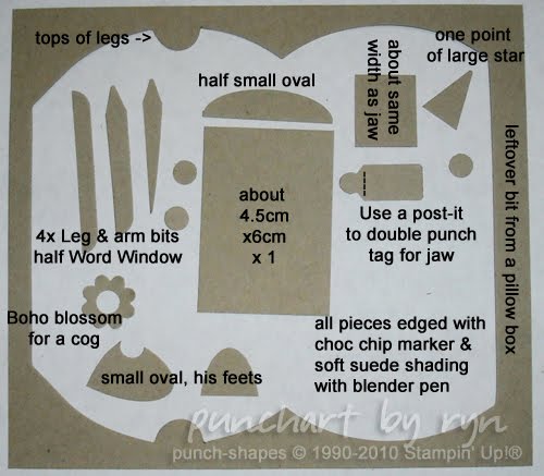
Now to the meat in the sandwich! Here's my contribution, a punch art up-sized version of the little "Get well soon" robot in Lots of Bots. I had loads of Kraft cardstock left over after doing those many many pillow boxes for Mother's Day, so I've used up some scraps to make Mr Bot here. He's so forlorn and sweet! Anyway, I've repaired his arm so he's not looking quite so broken...

The pieces I used:

Well that’s all from me. Next stop on the INKlings’ Team Blog Hop is my fellow Children's Hospital volunteer, Fiona Brown. Have fun and don't forget to leave a comment on each blog to win some great Blog Candy.

Tuesday, May 11, 2010

Anything but Mother's Day cards

So I was looking for inspiration for a card the other day and wondered if any Elite Challenges had been posted. I'm a member of Angela Sargeant's downline and every month Carol Dunstan posts challenges in which any member of the Elite team can participate. So here's my answer to the May colour challenge, Razzleberry Breeze, and also to the stamp set challenge. I was so glad to be making something other than Mother's Day cards, and other than chocolate boxes!
So here's the reason I wanted to do something different - these are the chocolate pillow-boxes I made for my children's school Mother's Day stall last week. All the tags have the "One of a Kind" (c) Stampin' Up! stamp on the back, which I find endlessly amusing when I'm stamping out 300 Mother's Day items!
These are bath salts I put together at the last minute. Neroli, Lavendar, Rose and Patchouli. I should have done Lime for the last lot - Patchouli didn't sell well! The labels were printed up on the computer.
While I was sitting selling raffle tickets with my leg up and an ice pack on my ankle (short version: I sprained it on the way into the school while carrying the box of chocolate things), I made some more tags. I'd already stamped them out and run some tape along the back of the card-strip, so it was just a matter of punching them out. We sold them 2 for 50 cents and they were quite popular. I have stacks left over though.
I didn't manage to take a picture of the 100 Mother's Day cards I pumped out. The camera battery went flat! They were all single layer cards without embellishment and with matching envelopes. They sold reasonably well too - I've some leftovers, so I'll post the results when I've taken photos!